Bright Winter Colors - Complete Guide
Complete guide to Bright Winter colors, palette direction, and color combinations for the brightest Winter season.
Bright Winter Color Palette
Bright Winter colors push Winter contrast to its sharpest point: ice white, zinc grey, ink black, electric cyan, sapphire blue, emerald, phosphor lime, hot pink, amethyst, and ruby red. The palette reads futuristic, vivid, and jewel-bright.
Recommended Color Combinations
Bright Winter outfits work when the contrast is crisp and the accents stay electric. Anchor with black, white, or zinc grey, then add one or two vivid hits such as sapphire, emerald, hot pink, ruby, or chartreuse.
Bright Winter Palette Generator
Start with a clear high-energy anchor and generate palettes that stay bright, cool, and highly saturated instead of muted, earthy, or powdery.
Base Colors
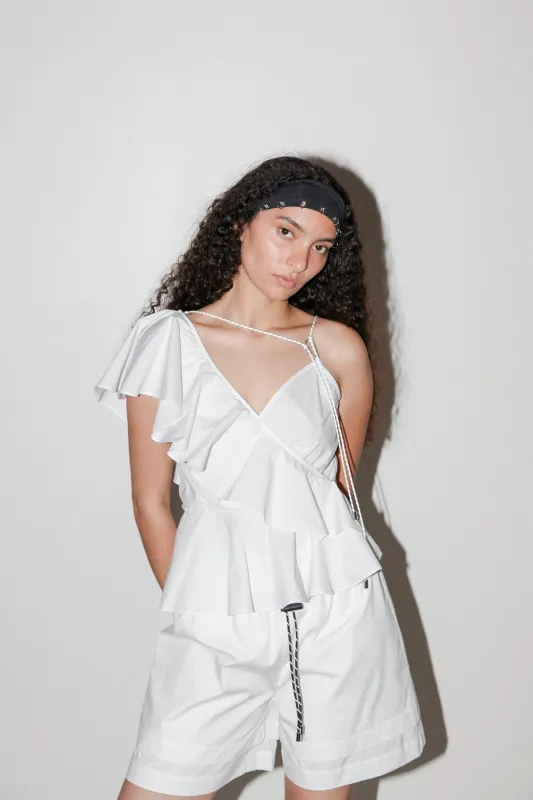
Use for major pieces, statement items, dresses, and blazers.
Neutrals
Use for everyday basics, pants, skirts, and foundation pieces.
Accents
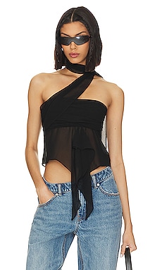
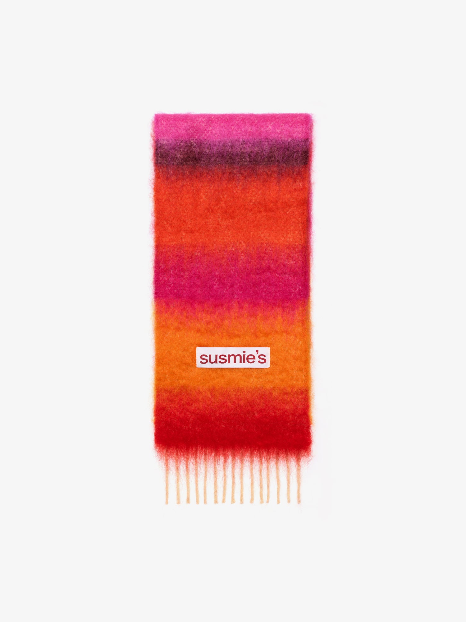
Use for accessories, tops, jewelry, and controlled pops of color.


Clothing Recommendations are generated using the palette above. Select a different season, hue, or combination controls for different options.
Bright Winter Characteristics
Bright Winter is the brightest, sharpest Winter season: cool, highly contrasted, and extremely vivid. Dream Wardrobe describes it as an extreme meeting point of winter darkness and spring brightness, with black-and-white structure, metallic greys, and jewel-toned brights.
Physical Features
- Eyes: Blue, cyan, emerald green, light hazel, or brown-black
- Skin: Clear skin with neutral or neutral-cool undertones
- Hair: Medium brown through dark brown to black with neutral or cool tones
- Overall: Very high contrast with a crisp, luminous, clear appearance
Color Qualities
- Temperature: Cool overall, but slightly warmer than True Winter because of Bright Spring influence
- Saturation: Extremely high, with vivid jewel tones and almost phosphorescent brightness
- Contrast: Extreme light-dark contrast supported by black, white, and metallic greys
- Avoid: Dusty muted shades, earthy browns, and soft low-contrast blends