Dark Winter Colors - Complete Guide
Complete guide to Dark Winter colors, palette direction, and color combinations for the deepest Winter season.
Dark Winter Color Palette
Dark Winter colors combine cool depth with high contrast: black, granite, charcoal, Prussian blue, sapphire, petrol teal, pine green, raspberry, orchid, and garnet. The palette is intense and winter-clear, but it borrows a touch of Dark Autumn richness.
Recommended Color Combinations
Dark Winter outfits look strongest when a deep neutral does most of the work. Pair black, charcoal, or Prussian blue with one saturated accent such as raspberry, petrol teal, pine green, or garnet.
Dark Winter Palette Generator
Start with a deep cool anchor and generate palettes that stay dark, sharp, and jewel-toned instead of dusty, light, or golden.
Base Colors
Use for major pieces, statement items, dresses, and blazers.
Neutrals
Use for everyday basics, pants, skirts, and foundation pieces.
Accents
Use for accessories, tops, jewelry, and controlled pops of color.

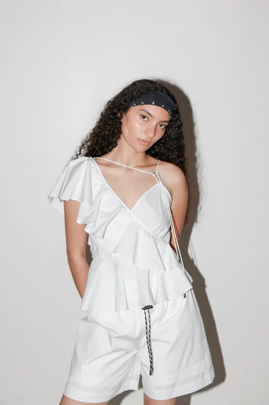


Pierced Headband


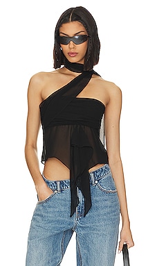
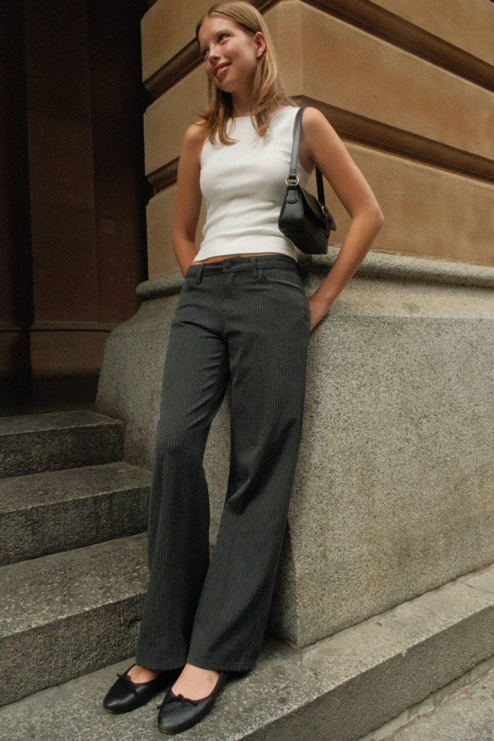
Clothing Recommendations are generated using the palette above. Select a different season, hue, or combination controls for different options.
Dark Winter Characteristics
Dark Winter is the deepest Winter season: dark first, cool second, with very high contrast between features. Dream Wardrobe frames it as a palette of cool depth, clear saturation, and forest-fruit drama supported by granite greys and Prussian blues.
Physical Features
- Eyes: Hazel, dark olive, dark brown, or black
- Skin: Neutral, cool, or olive skin tones
- Hair: Medium brown through dark brown to black with neutral or ashy tones
- Overall: High contrast with visible depth in the eyes and hair
Color Qualities
- Temperature: Cool overall, with a slight richness borrowed from Dark Autumn
- Saturation: Intense and relatively clear despite the darkness
- Contrast: High contrast with dark neutrals and sharp accents
- Avoid: Chalky pastels, beige softness, and warm orange-heavy palettes